
NOW WORKING WITH BRANDS ACROSS USA · UK · INDIA · UAE · AUS


Brenta x WooCommerce
WordPress Custom Design & Development · Lead Generation · EdTech



THE PROBLEM
A CATEGORY-DEFINING PRODUCT. A WEBSITE THAT WASN'T MAKING THE CASE.
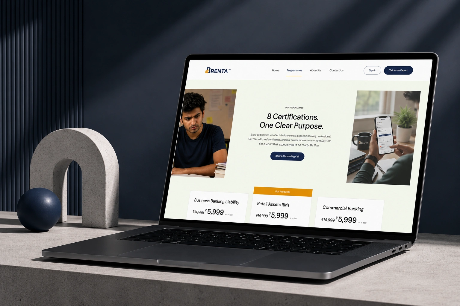
Brenta had a genuine and rare proposition - 8 banking certifications built by ex-bankers with 20 to 36 years of real-role experience, completable in a fraction of the time of traditional courses. The website wasn't communicating any of it with the clarity the proposition deserved.
Counselling call bookings were low despite strong organic interest. Bounce rates were high - visitors who would have been perfect candidates were leaving before they'd seen the comparison table, the mentor profiles, or the programme structure. The site read like a training company. Brenta needed to read like an institution.
WHAT WE DID
REDESIGNED THE WEBSITE AROUND ONE ARGUMENT: NO ONE ELSE TEACHES BANKING LIKE THIS.
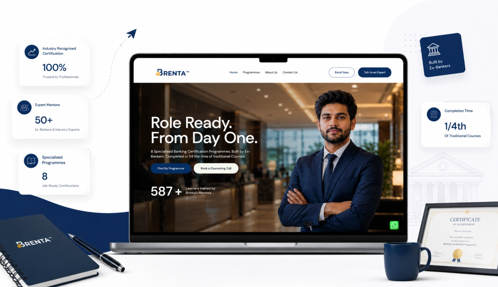
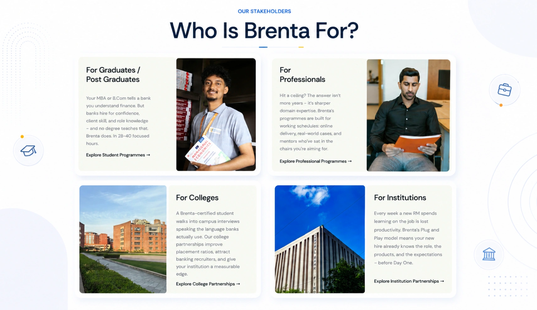
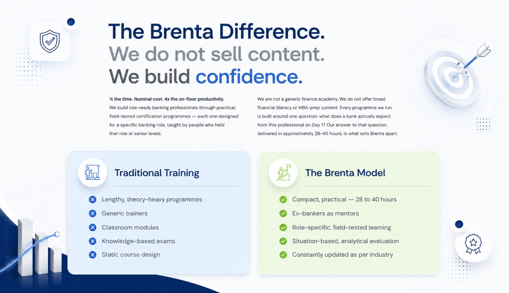
We started by identifying what was making the right candidates leave. The hero lacked a clear, outcome-led statement. The mentor credentials - the single most powerful trust signal Brenta had - were buried three scrolls deep. The comparison between Brenta and traditional training was the sharpest piece of copy on the site, but it wasn't visible until most visitors had already decided to leave.
We restructured the entire page hierarchy around these three things: a clear outcome in the hero, mentor credibility surfaced immediately, and the comparison table repositioned as the central conversion argument.
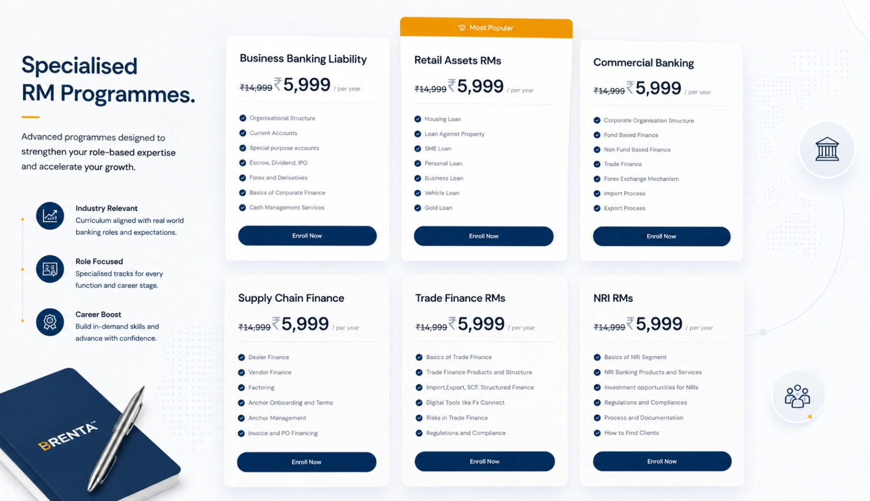
The programmes page was rebuilt as a structured selection tool - each certification with role clarity, topic list, pricing, and a direct enrolment path. The counselling call CTA was made persistent throughout the page so the conversion moment was never more than a click away.
THE RESULT
MORE COUNSELLING CALLS. FEWER BOUNCES. CANDIDATES CONVERTING WITH CONFIDENCE.
Within weeks of the new site going live, the metrics told a clear story. Conversion rate on counselling call bookings increased by 35%. Bounce rate dropped 43% - candidates who arrived were staying long enough to understand the proposition before deciding. Retention of engaged visitors improved 28%, with users moving through the programme pages, mentor profiles, and comparison sections in a structured way rather than dropping off.
Brenta's website now does what the platform itself has always done: it makes the case clearly, confidently, and without wasted words.
LET'S BUILD
YOUR STORE




 INTELLIGENT AUTOMATION
GLOBAL SUPPORT
INTELLIGENT AUTOMATION
GLOBAL SUPPORT